Featured
REVIEW: Pounds of Power #1
4.08/5.0 Stars
Rating if the Book Were a Movie: PG-13
Creative Team:
Writer: Lahna Turner
Artist: Hugo Petrus
Colors: Werner Sanchez
Letters: Lettersquids
Cover: Hugo Petrus
Editor: Andrea Lorenzo Molinari
Visual and Editorial Consultant: April May
Creative Consultant: August May
Publisher: Antarctic Press
Ratings:
Story: 4.1 Stars
Artwork: 4.2 Stars
Cover Artwork: 3.7 Stars
Dialogue: 4.2 Stars
Mechanics: 4.1 Stars
Editing: 4.2 Stars
About the Book:
Pounds of Power begins in the science lab of Evale’s corporate building. The lab is being raided for the research findings from Dr. Askew’s latest scientific studies. As it turns out, Dr. Askew has found a way to convert fat into energy and abilities that could make someone a Meta.
The thing is power like this in the wrong hands could lead to unspeakable evils. Enter Johnny, one of Evale’s top technology gurus. Johnny is almost everything one would envision when they hear the word “nerd”. He’s a great guy, but socially awkward. He has a collection of science fiction memorabilia that belongs in a museum. He is also vastly overweight, which could make him the perfect candidate for Dr. Askew’s research.
Reader’s Notes:
I always talk about the holy trinity of the first issue of a title. You need to have a plausible setting, plot, and at least one compelling character. The setting tends to be the easiest of the three by virtue of being able to put an editor’s note in the first panel. Either that note the creator can establish that these adventures are taking place in Small Town, USA or aboard the “U.S.S. Findsomethingsowehaveastory”.
The plot and character development are usually more difficult to establish in a comic book. The creators have roughly 24 pages to make miracles happen. Now it’s go time. There needs to be something about the plot or a character that latches on to the reader and makes them want more. “Pounds of Power” is able to do both.
This story hits the ground running with action as soon as you start on the first page. There’s no “Once Upon a Time…” in a peaceful meadow. We have klaxon alarms and gunshots. It’s perfect. It makes the reader want to figure out what is happening and why.
We get outstanding character development with Johnny. He’s good at his job. He’s somewhat socially awkward. He loves his geek memorabilia. I can easily see him being part of my gaming group. I just spent last weekend with 1000’s of Johnnys at Comic-Con!
I also found that some of Johnny’s mannerisms reminded me of the late comedian, Ralphie May. I found out after reading it that it was dedicated to him. I never had the opportunity to see Mr. May perform live. I’ve seen plenty of his work online. On stage Mr. May had a large presence. His personality filled the room. This book made me wonder if that was a stage persona. Away from the spotlight and microphone was he more akin to what we saw in Johnny?
I also liked how in just two short pages we learned everything we needed to know about Evan Vale. The man is a rich chauvinist blowhard. You can tell he gaslights every time things don’t go his way or if he’s called out on any of his nonsense. He’s very easy to dislike. It’s not difficult to envision someone in our world that could be drawn upon for inspiration as art imitates life with Vale.
I really like how this book fights back against the unrealistic bodies we see so much of in comics. Almost every male hero in every titles checks at least three of the four unspoken requirements to be a hero. They are six feet plus in height. They’re extremely muscular, to the point of having an “eight pack” and a BMI under five percent. More often than not they’re also the best looking guy in the room. They also tend to have something in their origin history that makes their love interests say, “You poor thing. Let me do something that will take your mind off of that for a little while”.
For the other 99.995 percent of us Johnny is a welcome sight. He means more representation. I hope he is the beginning of a wave characters that don’t look like they stepped away from a day of modeling and being a man whore to fight crime.
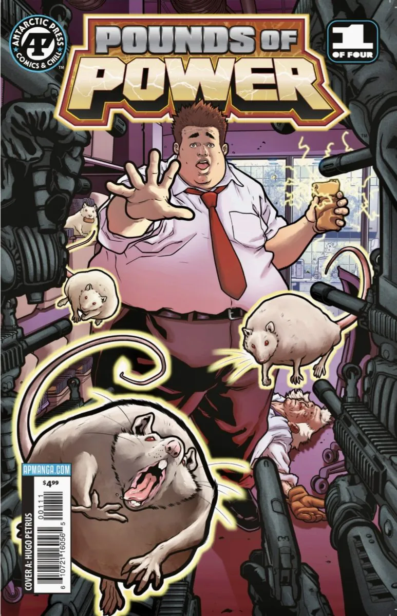
I loved how the artwork on the cover is relevant to the story. There are so many times where that is not the case. This gives prospective readers a glimpse of what they can expect when they dive into this book.
I’d like it more if the cover itself wasn’t quite so busy. The artwork is great. The rats and soldiers pull attention away from Johnny. He’s the star of the series. He should be front and center on the cover of the first issue, without distractions.
I was very happy with the line artwork and coloring on the interior pages. Petrus has a keen sense of completion that allows for enough detail in the background to set the scene without having so much that it causes the reader to lose focus on the story. I loved his depictions of Evan Vale when Johnny was describing him.
I have said it before. I’ll say it again. Lettering in comic books is one of the most under appreciated arts in the industry. If a letterer is great their work is not thought about. If they make a mistake it has the ability to affect the story. The worlk by Lettersquids was noticed and appreciated.
“Pounds of Power” is not your typical comic book story. It does not have a stylish hunk juggling multiple love interests while fighting crime. It doesn’t have a collection of demigods teaming up to fight an evil syndicate in a huge city. It has something better. It has humanity. It gives the reader a feeling that this could be them. As a geek on a budget I believe that makes “Pounds of Power” well worth the price of admission.
“Pounds of Power” will be appearing on the shelves of your local comic book store in April. Talk to your shop owner to get it added to your pull list!